

 | SELFISH WORLD")


 You Need to Know | SELFISH WORLD")


 | SELFISH WORLD")


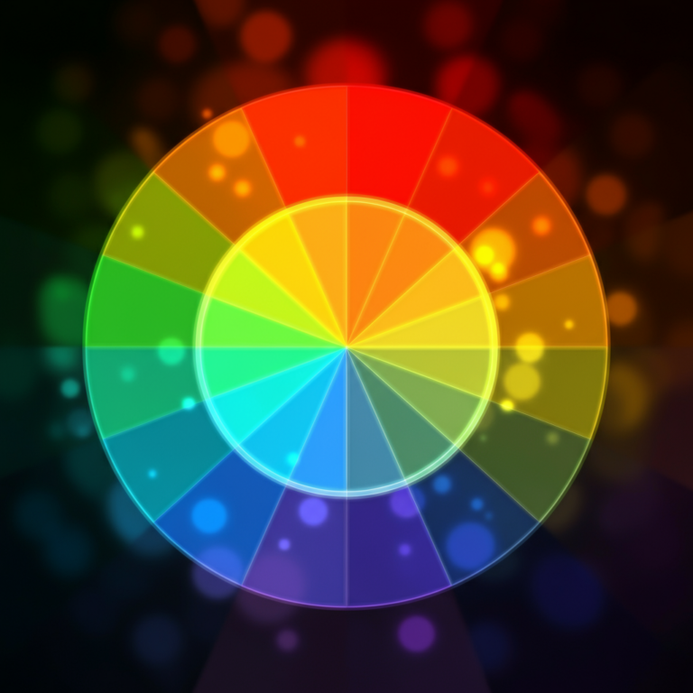
Colors are everywhere. From the calming blues of the ocean to the vibrant reds of a firetruck, colors play an integral role in our lives. But did you know that colors do more than just please the eye? They have a profound effect on our emotions, behaviors, and even how we perceive the world around us. This post explores some fascinating ways colors influence our lives, backed by psychology and science. Whether you’re picking a color scheme for your home, your next outfit, or your brand, these insights just might change your decision-making process.
Why Do Colors Have Such a Strong Impact on Us?
The human relationship with color goes beyond aesthetic appeal. It’s rooted deeply in biology and culture. Scientifically, colors influence our brain and hormones, while culturally, they carry different associations and meanings.
The Science Behind Color Perception
When light enters our eyes, it interacts with photo-receptors on the retina. These receptors process the wavelengths of light and translate them into what we perceive as colors. Different colors affect various areas of the brain. For example, red often triggers a fight-or-flight response, causing excitement or urgency, while blue evokes calmness due to its association with open skies and water.
Cultural Influence on Color Meaning
Cultural upbringing often dictates how colors are interpreted. For instance:
- White represents purity in Western cultures but is associated with mourning in some Eastern cultures.
- Red symbolizes prosperity and joy in China but is often linked to danger or warnings in the West.
Understanding these cultural nuances is key for marketers, designers, and individuals working globally.
The Psychology of Color and Mood
Have you noticed how certain colors can perk you up or, conversely, make you feel at ease? This isn’t just your imagination. Colors are known to evoke specific emotional responses.
Warm Colors
Red
Red is a stimulating and attention-grabbing color. It’s often associated with passion, energy, and action. However, excessive exposure to red can increase feelings of aggression or heighten stress.
Fun Fact: Restaurants often use red because it’s thought to stimulate appetite.
Orange
Orange carries the energy of red but softens it with the optimism of yellow. This makes it a friendly and exciting color, often associated with creativity and enthusiasm.
Use it if you need a little motivation—orange is known as the color of “get-up-and-go.”
Yellow
Known as the “happiest color,” yellow is linked to optimism and joy. However, when overused, it may create anxiety, as it’s the most challenging color for the eye to process.
Ever wondered why post-it notes are yellow? It’s because the color can boost memory and focus.
Cool Colors
Blue
Blue offers serenity and calm. It’s often used in spaces like bedrooms to instill relaxation. However, some find blue to be cold or uninviting when overused.
Fun Tip: Blue lights are used in public spaces to reduce stress levels.
Green
Green provides balance and harmony, likely due to its strong connection to nature. It’s been shown to reduce anxiety and improve focus.
Is it any wonder why many hospitals often use green in recovery rooms?
Purple
Purple is often associated with luxury, spirituality, and creativity. Historically, it was reserved for royalty because of the rarity and cost of purple dye.
Want to inspire innovation? Try incorporating purple into your workspace.
Neutral Colors
Black
Black evokes power, sophistication, and elegance. It’s also the color of mystery. However, excessive black can feel heavy or overwhelming.
White
White symbolizes cleanliness and simplicity. It creates a sense of space and openness, making it perfect for small rooms.
Gray
The ultimate neutral, gray can feel calm and composed but might read as dull or uninspiring when overused.
How Colors Influence Perception in Different Contexts
Colors don’t just affect emotions. They also subtly alter how we perceive environments, products, and people. Here’s how:
Interior Spaces
Colors can change how we perceive space and environment:
- Light colors (white, beige, light blues): Make rooms feel bigger.
- Dark colors (navy, chocolate, black): Create a cozier, more intimate feel.
Want to make environments more inviting? Opt for soft greens or warm neutrals that promote comfort and harmony.
Branding and Marketing
Marketers rely on color psychology to influence decision-making. Certain colors are selected explicitly for logos, campaigns, and ads because of their psychological effects:
- Red is energizing and drives urgency (think Sale or Limited Offer).
- Green suggests eco-friendliness or health-conscious branding.
- Blue inspires trust and professionalism—most often used by banks and tech companies.
Wonder why fast-food chains often use bright colors like red and yellow? Together, they evoke appetite and excitement!
Fashion Choices
Colors can even impact how people perceive you:
- Blue conveys trust, making it great for interviews.
- Red suggests confidence and power.
- Black is versatile, lending itself to sophistication or authority.
Pick colors intentionally to suit the tone and setting, whether it’s for a boardroom or brunch.
Fun Color Facts You Didn’t Know
- The human eye can see about 10 million colors! This is thanks to specialized cells called cones in your retina.
- Pink wasn’t always seen as feminine. Until the 19th century, pink was considered a color for boys because it was closer to assertive red.
- Seeing green can improve reading ability. Some studies suggest that placing a green transparent sheet over text can enhance reading speed.
- There’s no universal “blue” in nature. The blue we see on animals like butterflies and peacocks comes from microscopic structures, not pigment.
How to Use Colors in Your Daily Life
Whether you’re painting your walls, choosing an outfit, or designing a website, incorporating the right color palette can elevate your experience or achieve specific goals.
- Need energy? Integrate red or orange tones into your workout gear.
- Seeking focus? Surround yourself with cool greens and blues.
- Want to impress? Black and gold are timeless staples.
Paying attention to color choices can help align your space, clothes, and projects with the mood or message you aim to convey.
Bring Color Into Your World With Intention
Colors are more than visual elements—they’re language, mood enhancers, and tools for self-expression. By understanding their impact, you can unlock their true potential in everything from your personal style to your professional brand.
Challenge yourself today to use colors strategically. Choose one intentional color to incorporate into your environment or wardrobe and observe its effect. It’s amazing how much a single hue can transform your mindset!


0 Comments